Onepint - OneTruth, Pint Planning & Control Center
Unified Source of Truth for all inventory types- on-hand, in transit, or vendor- managed and ATP (available to promise)

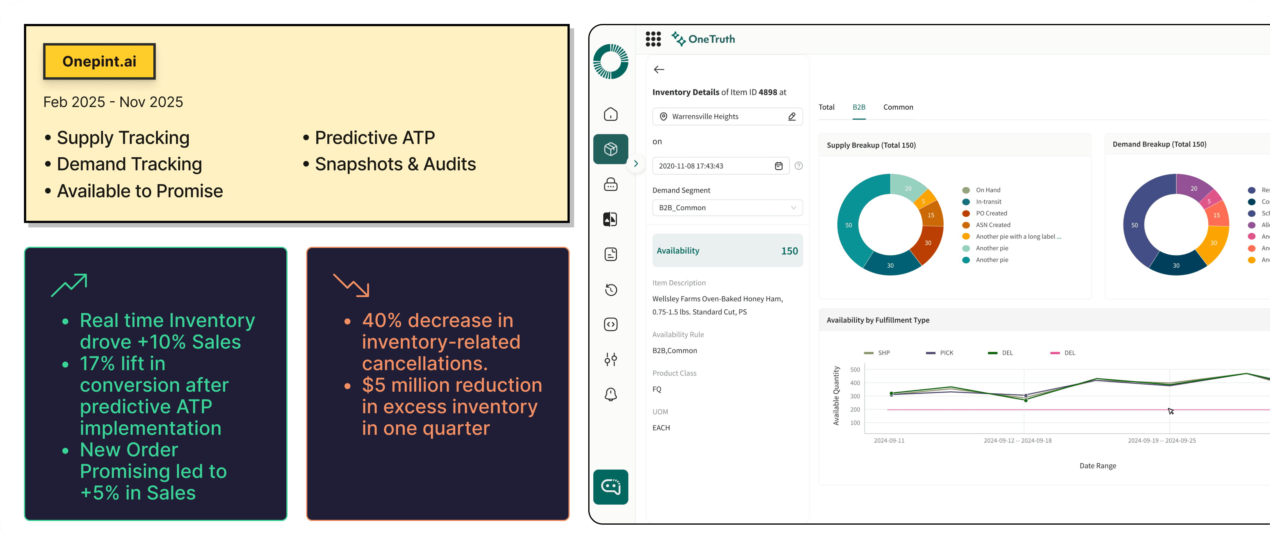
Product: OneTruth (AI-powered Unified Inventory Management Tool)
Role: UX Designer (part of cross-functional team with PMs, engineers, and data scientists)
Timeline: Q4 2024 - Q3 2025
Platform: Enterprise Web Application
Team: UX Designer × Director × Tech Lead × Data Science × Product Manager
Introduction
OneTruth - Trusted inventory, every time.
Although we have our robust OMS platform efficiently managing orders and inventory, we noticed planners still relied on manual analysis and spreadsheets for critical decisions. This revealed a gap between operational visibility and intelligent decision-making.
My Role & Approach
As the UX Designer, I conducted a heuristic evaluation to surface key issues in navigation, visual hierarchy, and task flows.
Key Design Improvement
Experience Modernization
Usability & Flow Optimization
Cognitive Load Reduction
Foundation-First Redesign
Skill demonstrated
Legacy Product Redesign & UX Modernization
Workflow Simplification & Efficiency Optimization
Visual System & Interaction Design
Conversational UX and voice UX
Outcome
Streamlined workflows and a modernized interface improved task speed and usability while preserving existing user mental models.
Challenge - What was broken
Redesigning the robust OMS platform into new intuitive modern platform
Designing for trust — users needed to understand how AI calculated inventory and promises.
Presenting large, complex data in a clean, scannable interface.
Maintaining continuity with existing OMS workflows while introducing new intelligence features.
Who the User is ?
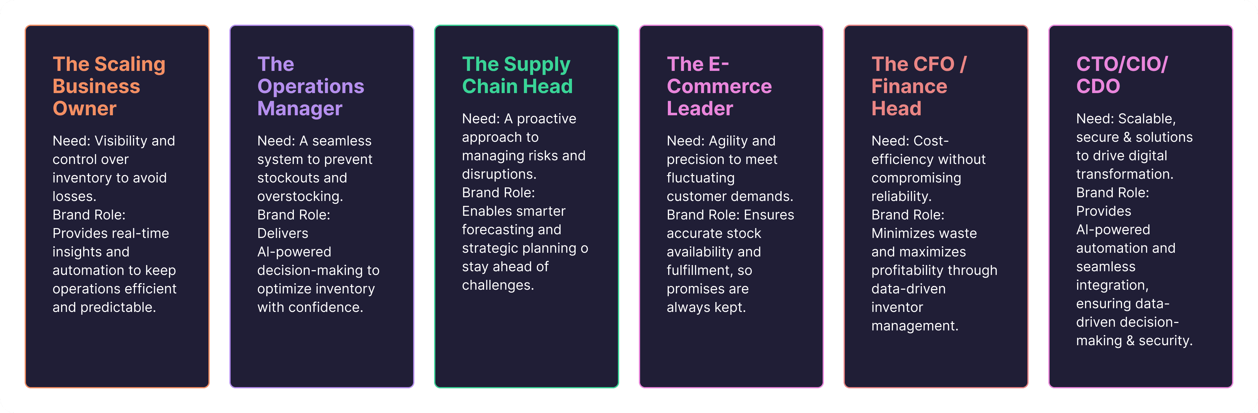
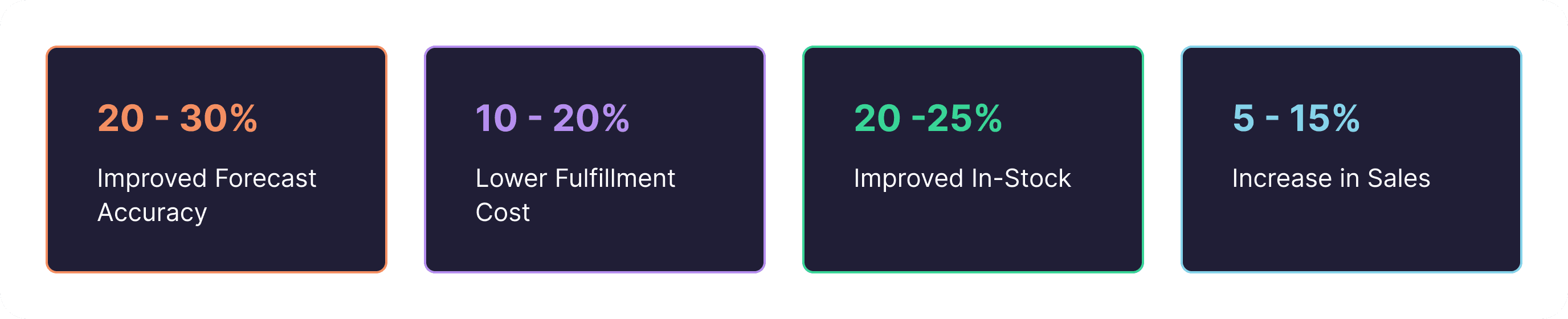
Why it mattered to the business
Forecast Accuracy: Inaccurate guessing that leads to either too much dusty inventory or empty shelves.
Fulfillment Costs: Expensive labor, high rush-shipping fees to fix errors, and high rent for storing items that aren't selling.
In-Stock Levels: Constant "Out of Stock" messages and backorders that frustrate and drive away customers.
Sales Growth: Stagnant revenue caused by missing products and being unable to compete with better-priced competitors.
Walkthroughs of Critical Flows
Search Filtering - Existing Version

Feedbacks
Cognitive overload for the customer
The user can't remove the item ID from the main screen.
Multiple clicks to perform a single task From this screen the user can delete them or add them.
No data upfront
Search Filtering - Improved Version

Improvements
Search filters are surfaced upfront, making discovery faster and reducing initial friction.
Bulk deselection of Item IDs is enabled, eliminating the need to unselect items one by one.
Fewer interactions required to run a search, reducing overall click count and task time.
Backend efficiency improved by fetching search results only after the user applies filters, minimizing unnecessary API calls.
Personalization options added so users can structure and view data in a way that fits their workflow.
Relevant data is shown upfront instead of an empty “No data found” state, helping users understand the type and structure of available data.
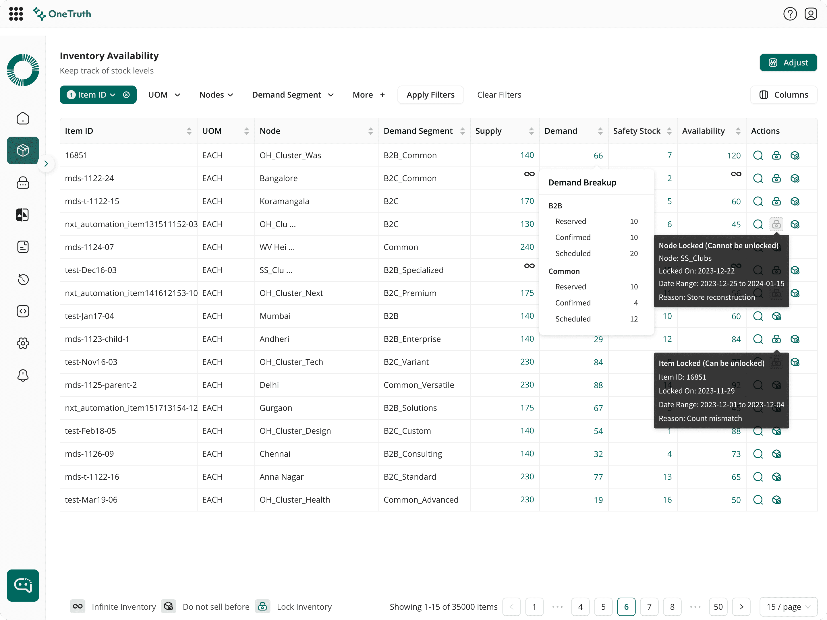
Inventory Details Screen
Existing Screens
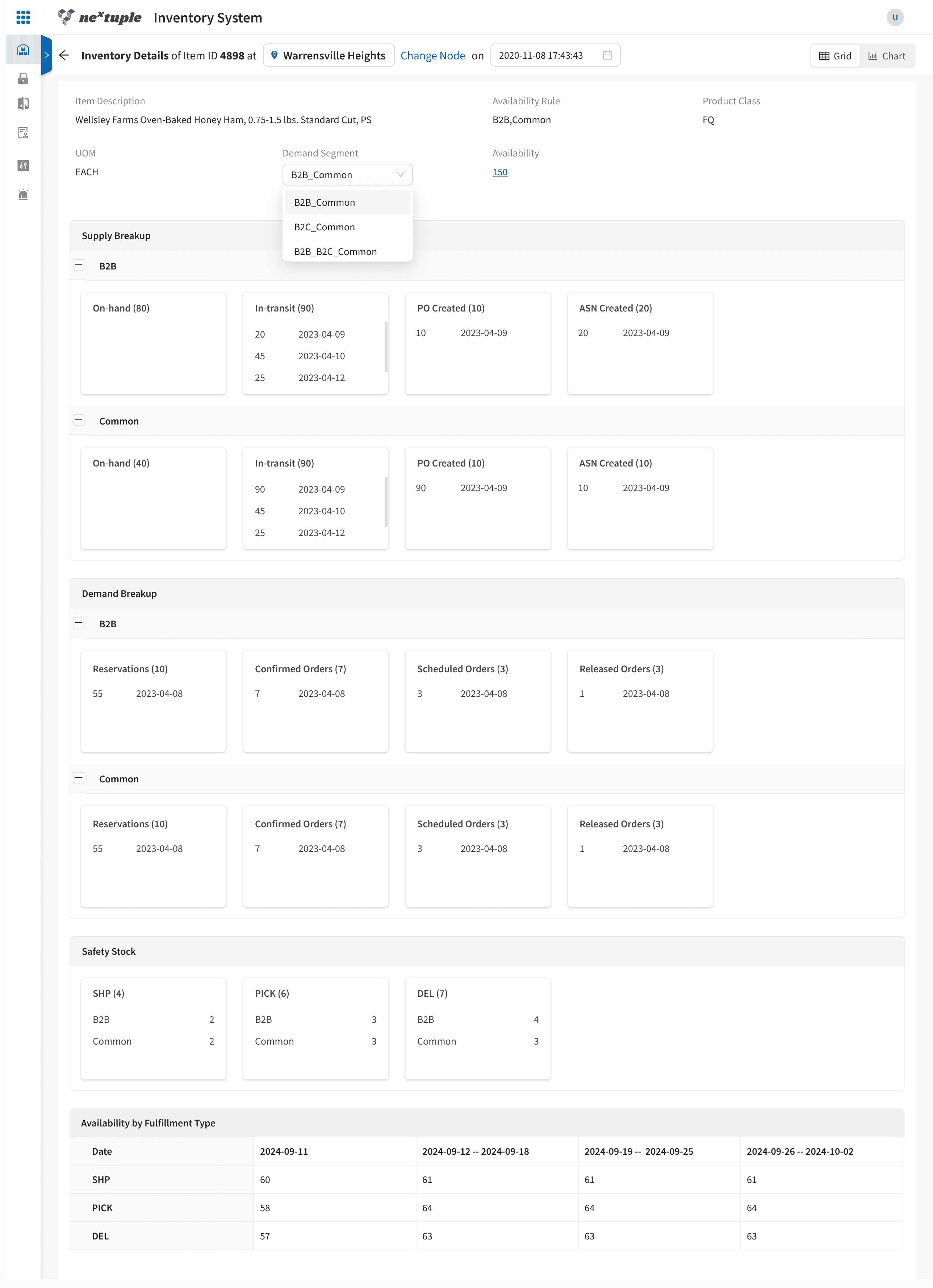
Feedbacks
Layout is not consistent and scattering of data
User has to do infinite scroll to read all the information that is shown
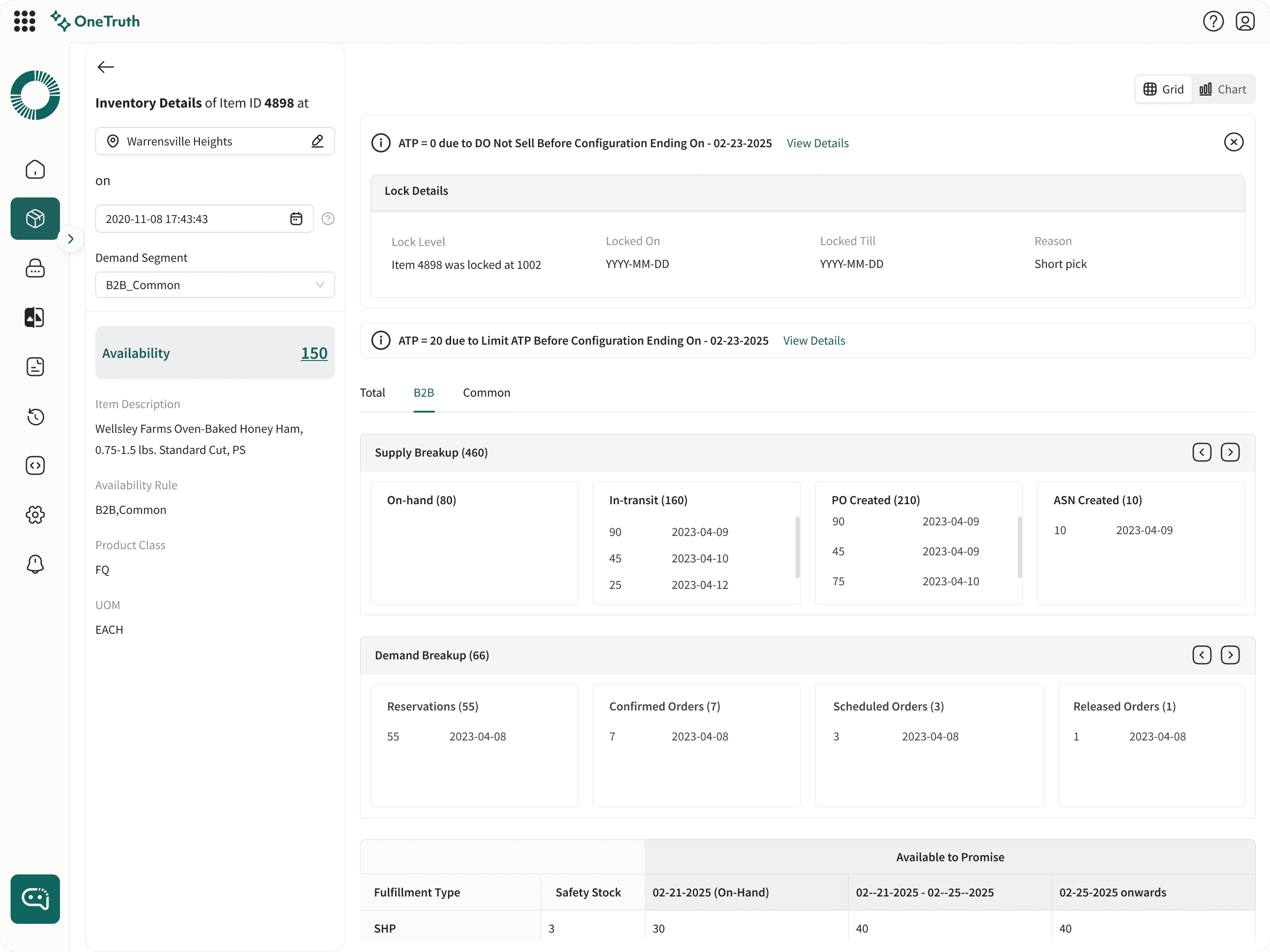
Improved Version
Layout has been changed with data segregated
Following a 80% 20% split
Reduced infinite scrolling
Data has been segregated
Highlighted only the primary data upfront
Secondary date will show up only on interaction
Hard design Problems!
No Stable data patterns
AI adoption improved when the interface respected existing mental models. Structuring outputs to mirror known data fields reduced cognitive load, increased predictability, and built trust
Probabilistic Output
Free-form AI recommendations raised trust questions. Progressive disclosure sources and confidence on demand, maintained speed while restoring credibility.
Multiple Conflicting Truth
When priorities conflicted, I used design to surface trade-offs and anchor decisions in user impact using options, prototypes, and scenarios to replace opinion with evidence.
User expected enterprise grade control
Because the product supported high-impact enterprise decisions, recommendations alone weren’t sufficient. Users needed visibility and the ability to review, adjust, or override system outputs
Yet needed fast, intuitive decisions
Although the workflow demanded enterprise-grade transparency and control, users operated under time pressure.
Hard design Problems
1. User-Initiated → AI Response (Controlled Input Model)
2. AI-Suggested, Human-Decided (Decision Support)
3. Predictive UX (Anticipatory Assistance)
4. Explanation & Transparency Layer
5. Learning by Observation (Adaptive Feedback Loop)
Information Architecture & Content Strategy
How Information Was Grouped
Information was grouped around user intent and decision stages, rather than around system outputs or data sources. The interface was structured into three logical layers:
Decision Layer
Primary actions, AI recommendations and outcomes
Context Layer
Alt suggestions, Supporting insights
Explanation Layer
Data sources, confidence indicators, and historical signals
What Was Elevated
Primary AI recommendations and next best actions
Critical signals that directly affected decisions
High-confidence predictions and learned patterns
What Was Suppressed (but still accessible)
Secondary metrics and edge-case data
Model-related complexity (scores, probabilities, internal logic)
Historical noise that didn’t change the immediate decision
What Was Intentionally Hidden
Raw model probabilities and technical explanations
Advanced configuration and governance controls
System-level diagnostics and logs
Information Architecture & Content Strategy
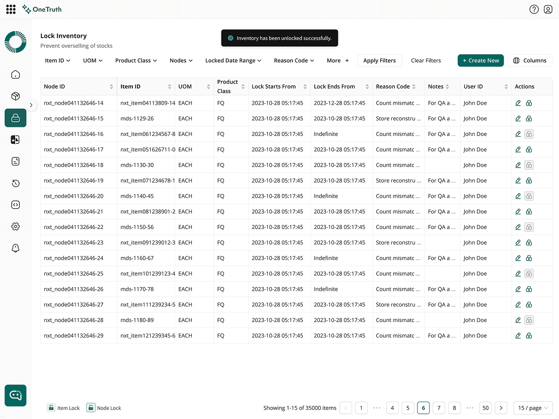
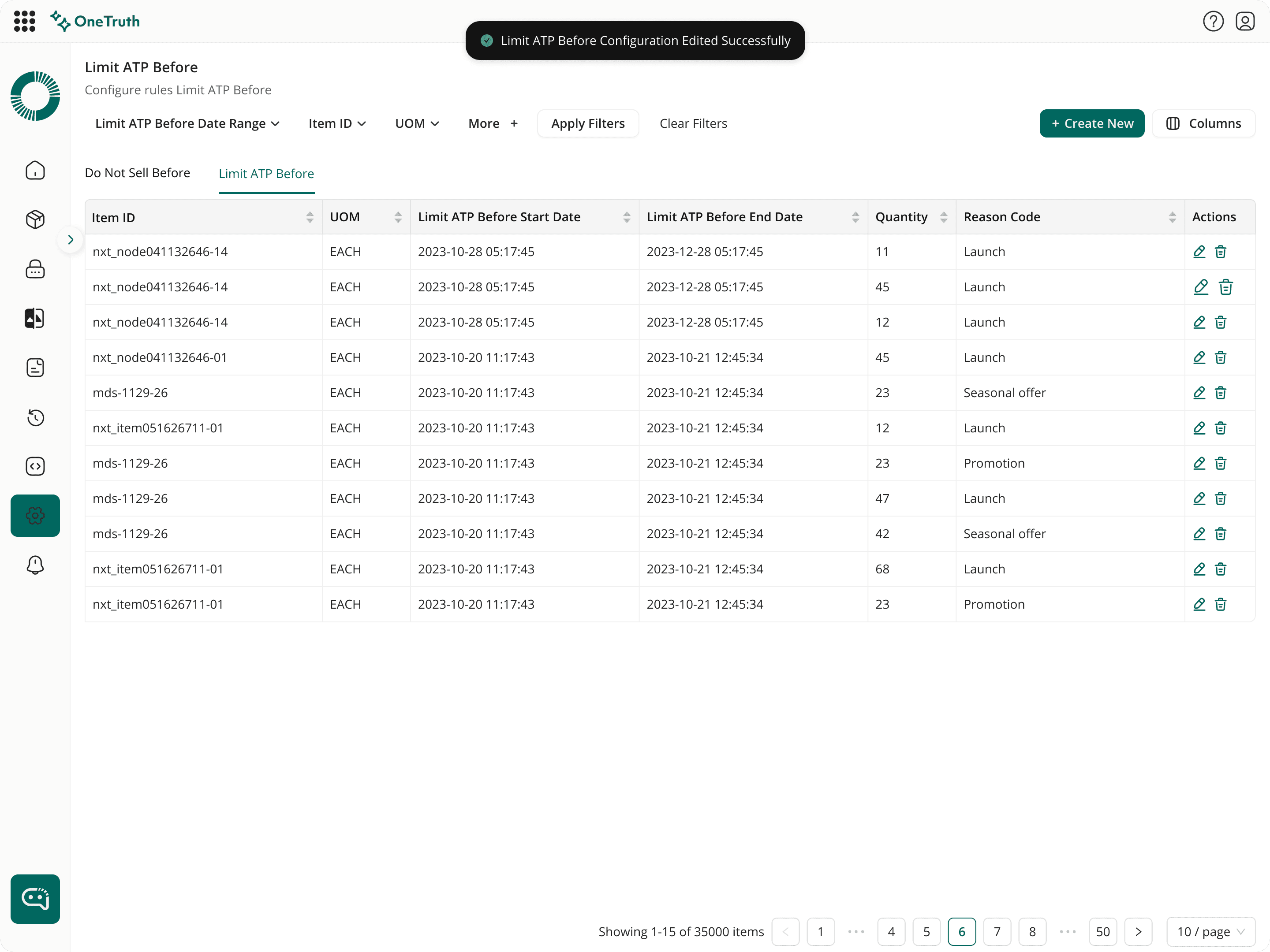
Why Alerts Were Contextual, Not Global
Global alerts were avoided because they lacked situational relevance and frequently interrupted workflows.
Instead, alerts were designed to appear only at the moment and place where user action was required.


Voice Interaction Design Decisions
What decision the user is making
In moments where users already know what they want to do, voice allows them to express intent faster than navigating menus or typing structured commands.
What friction was intentionally added or removed
Removed the need for manual input by allowing natural voice commands
Avoided forcing users to structure commands precisely
Required explicit confirmation for high-impact actions
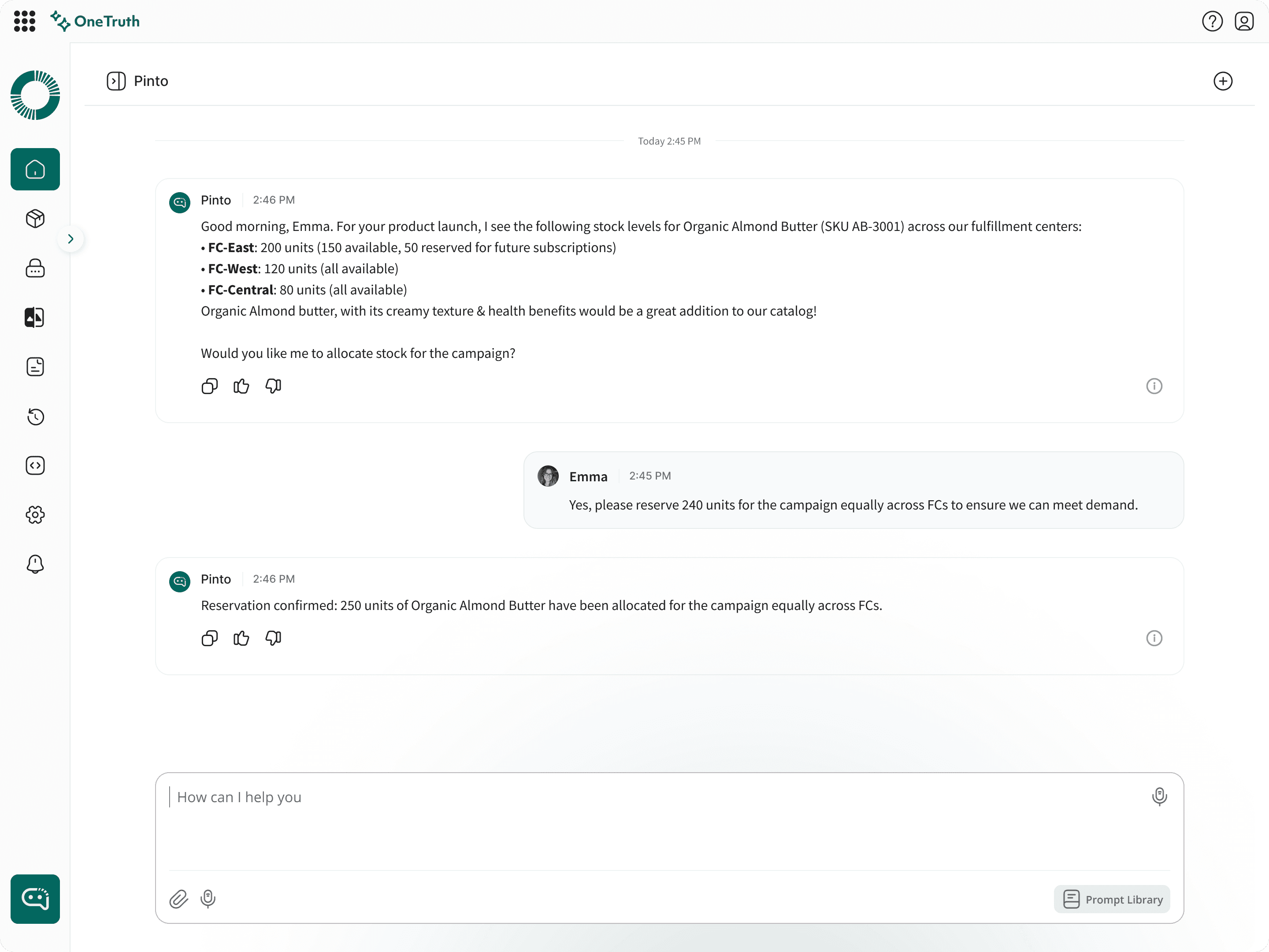
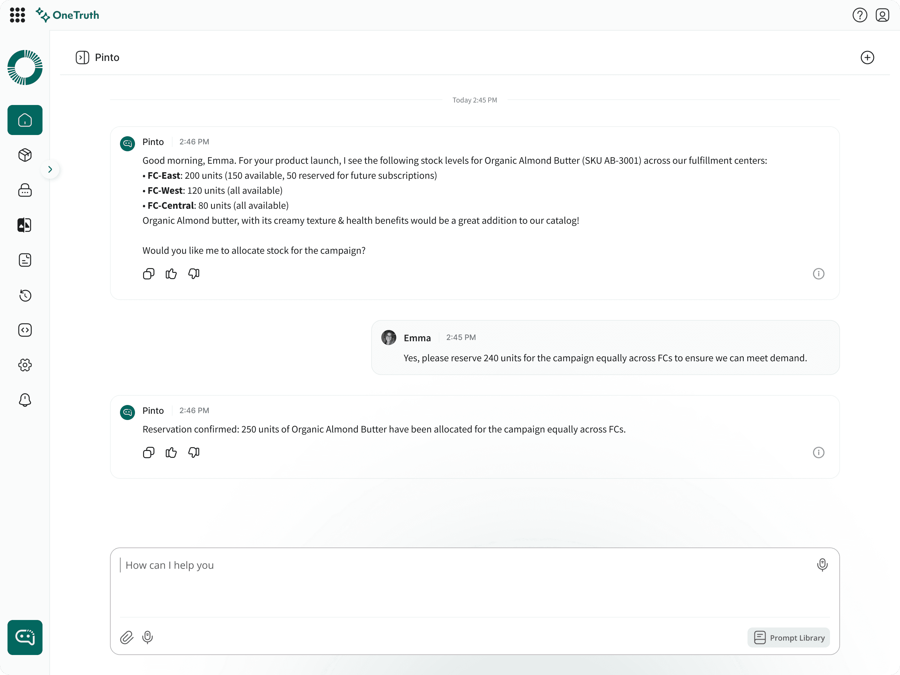
Chat Interaction Design Decisions
The need for user to scroll into infinity loops to view the full information that is provided by the pinto
Reduced the cognitive load for the user
The interaction reveals detail on demand, avoiding infinite scrolling and preserving context
Multi Tenant Interaction Design Decisions
The user is switching the tenant in order to view multiple organisation so checking the inventory and the associated stocks
Eliminated the need to log out and re-authenticate when switching tenants
Avoided multi-step flows for frequently accessed tenants
Chatbot Library
The user can save the commands and reuse them from the saved list
The pinto also suggest from the pre saved prompts so that the user can select from them
Visual Hierarchy & Data Visualization
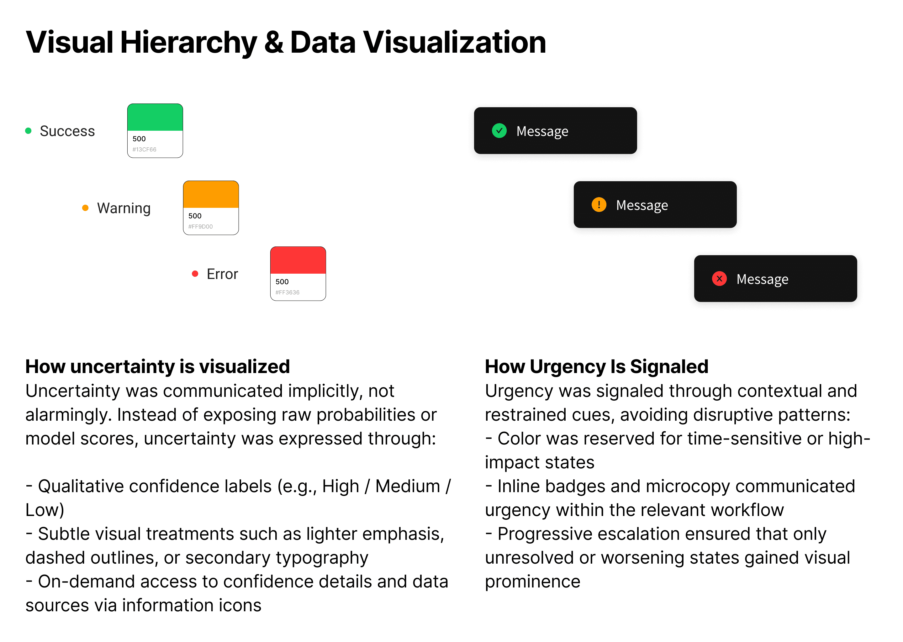
Visual Hierarchy & Data Visualization
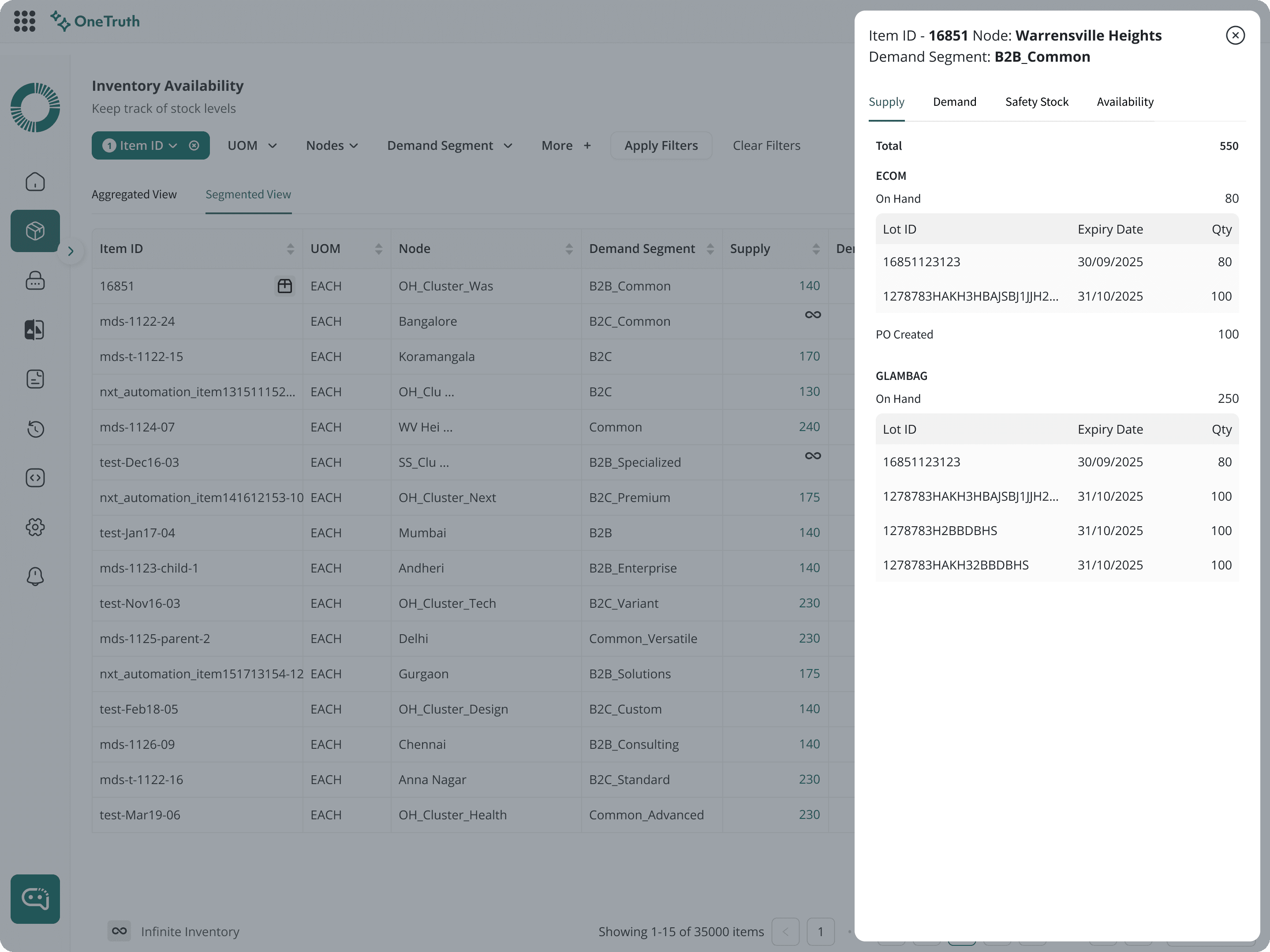
How Noise Is Suppressed
Noise was actively reduced by filtering out signals that didn’t change user decisions: - Secondary metrics were visually de-emphasized - Repetitive alerts were consolidated or throttled - Historical or low-confidence signals were hidden by default The system optimized for signal density, not data density.
Earlier Design Iterations
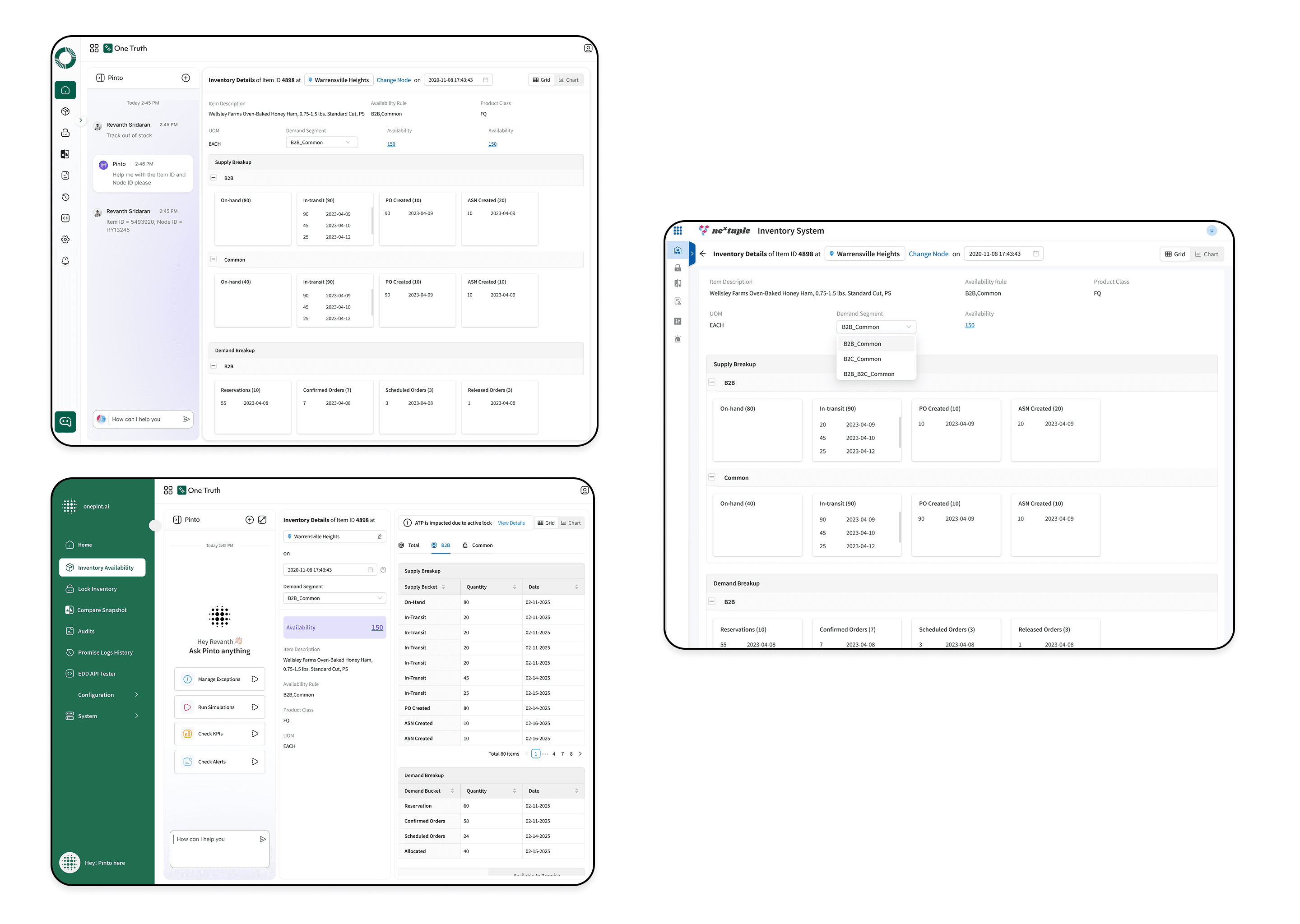
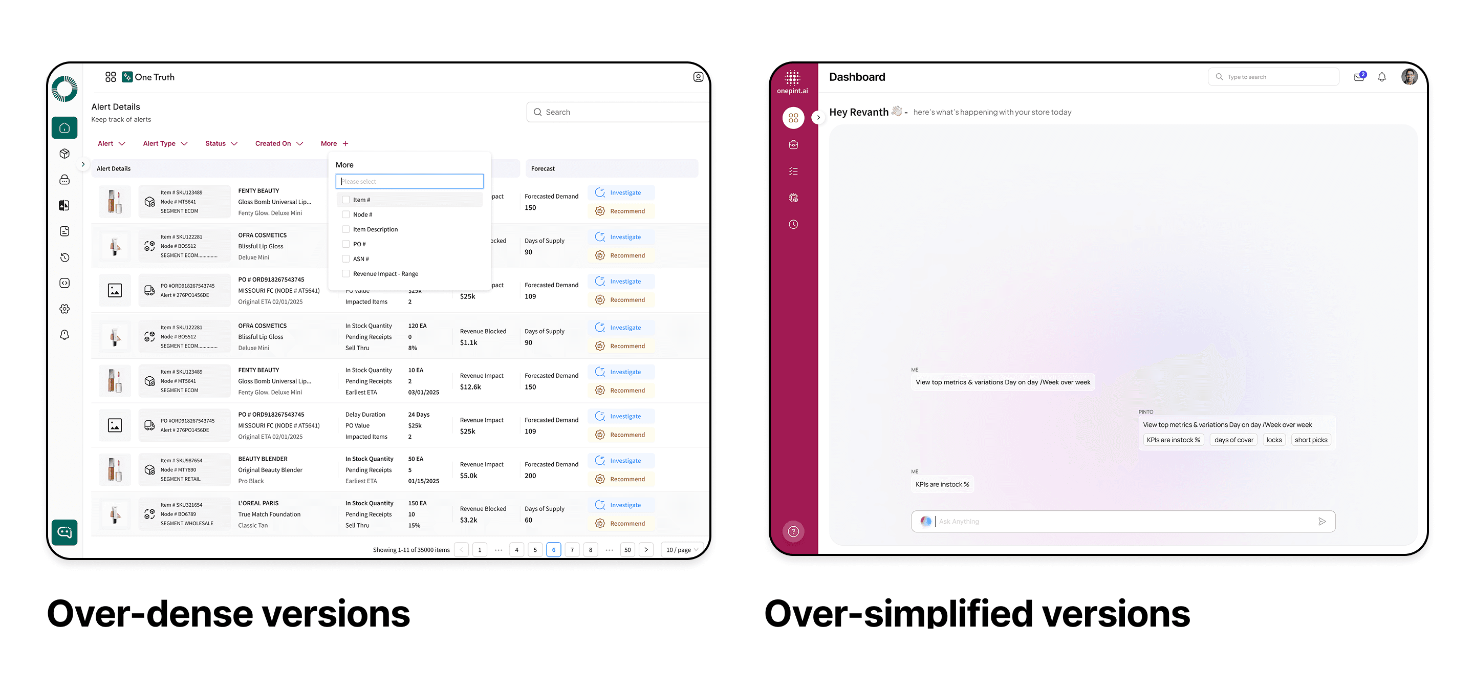
Final Design
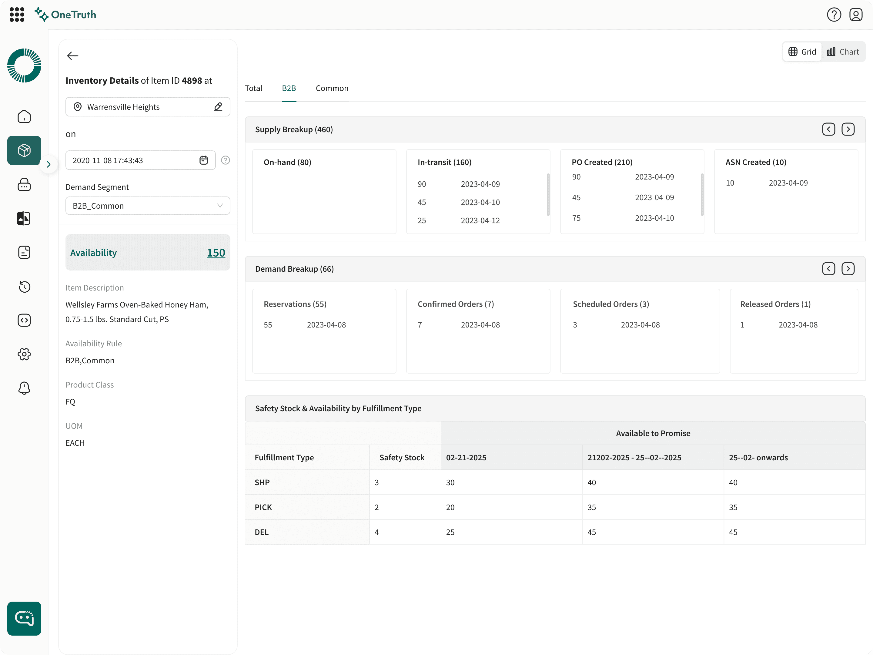
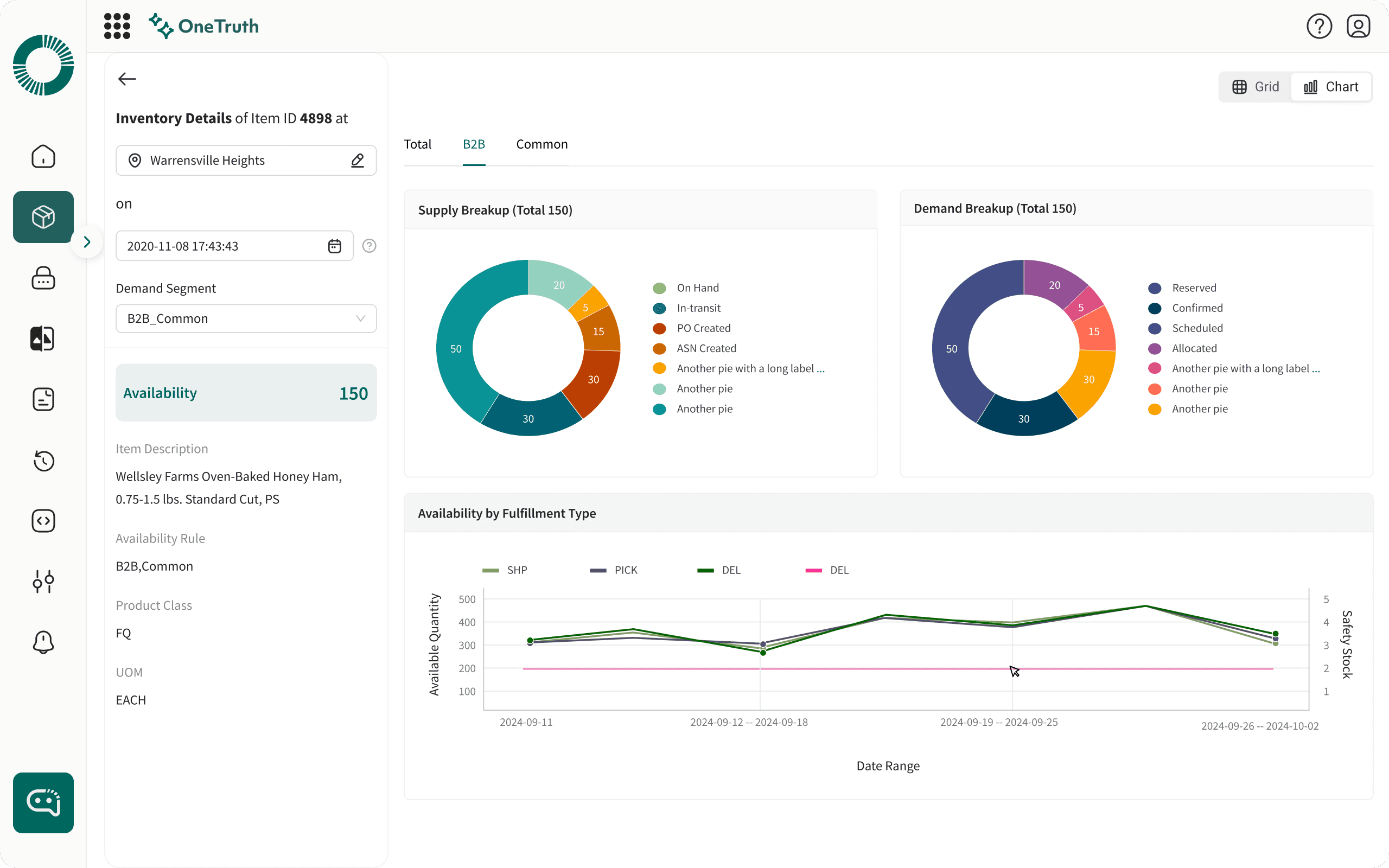

What decision is enabled here?
Only to show the the data that is relevant to the user in the first half/fold and then to show the secondary data in the second fold/details of the screen. To avoid cognitive load/showing more details at a time
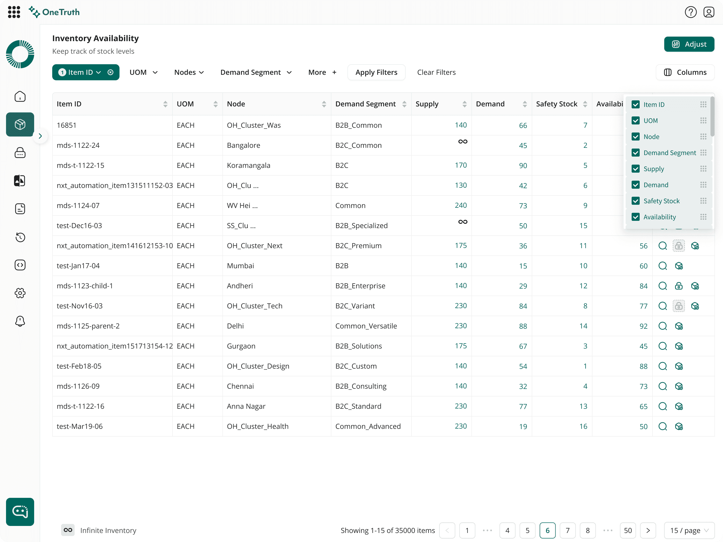
What decision is enabled here?
To enable the user to take quick action by showing all the filter information upfront without any secondary screens and also letting the user to cancelling the filter if something is not required for them to consider
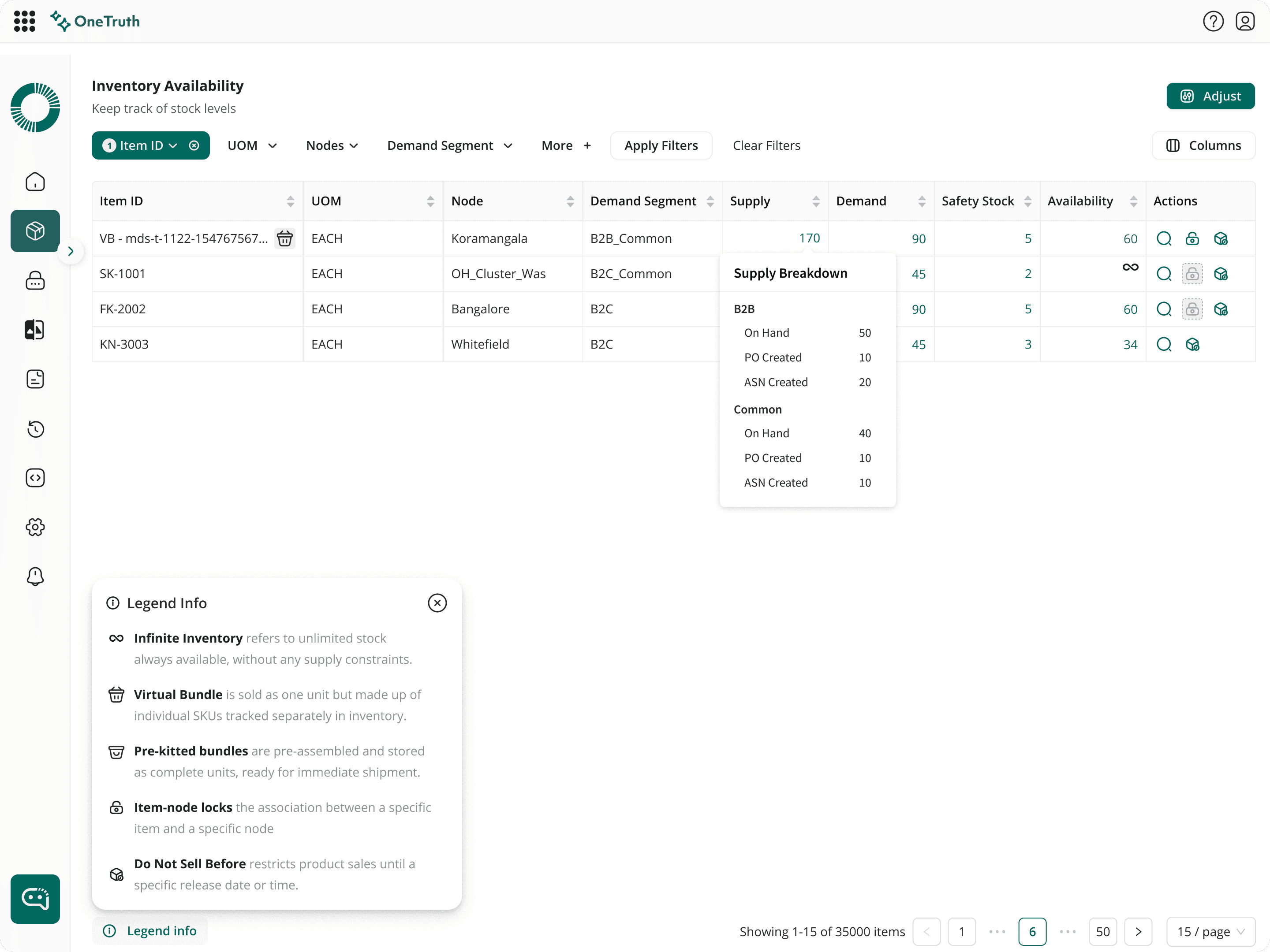
What decision is enabled here?
To declutter all additional information under a single area for ease of user and also by grouping the data for additional spacing

What decision is enabled here?
To provide the user a detailed/clarity about the system that is being shown upfront and also a personalisation for the user
Design System
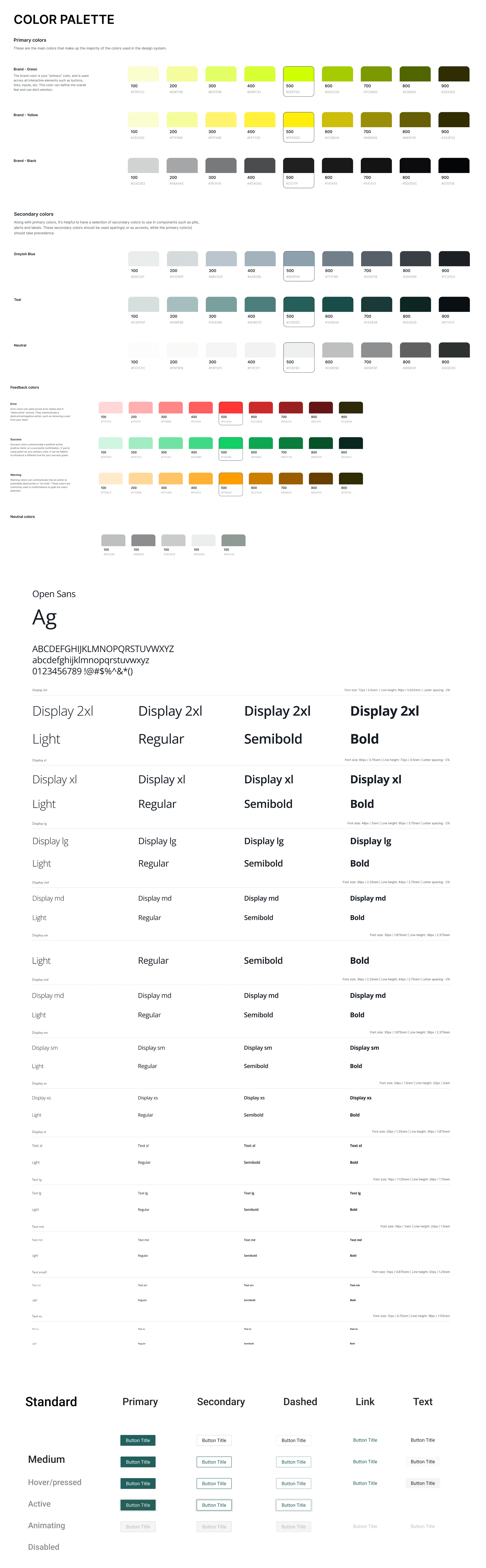
What This Reveals About My Design Ability
Design for decision-making rather than visual aesthetics
Structure complex information to reduce ambiguity and cognitive load
Use visual hierarchy to guide attention and user judgment
Simplify workflows by reducing steps and unnecessary interactions
Suppress noise by de-emphasizing non–decision-critical data
Select and apply appropriate mental models for AI-driven interactions
Impact :

These results are the real time results obtained from various clients
Future Enhancements
As a future enhancement, instead of relying on Pinto for full-page queries, we can introduce data-driven contextual bots that appear when users select specific data points, enabling more focused and relevant interactions.
List vs cards in the design decision would require a testing so that we can understand about the user workflow
Things I learned
Architected and launched Al-enhanced Inventory Planning System from 0 -> 1 and 1 -> 10. Took initiative as a lead designer to make significant changes to the UX and owning the design.
Initiated the GTM activites and created product demo videos
That's all folks!!!